Thursday, February 24, 2011

Ferris Bueller's House

This is old news and I'm probably the last person in the internet world to write about it. Remember the teen classic in the 80's called Ferris Bueller's Day Off? It was such a hit that some girls *ahem* me, watched it one time too many. The house that belonged to Bueller's best friend is up for sale.

There's a timeless appeal to the house with it's spectacular mid-century modern design that even after decades, people are still talking about it. The house is credible of yet another write-up and here goes...

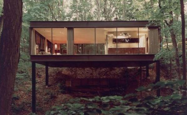
The 5,000 square foot bungalow is perched on a hill top and looks like a huge tree house.
ferris bueller house 1  Ferris Buellers Ferrari House on Sale
Source unknown

Ceiling to floor windows all around the living and dining room.
via Olive & Joy

Wooden details in the ceiling, stone top kitchen and glossy white cabinets. Isn't this the look that we've all come back to? It looks very much like the high-gloss cabinets that modern kitchen renovators are designing now.
via Olive & Joy

The glass garage housing the famous Ferrari that Bueller crashed.
via Olive & Joy

* Some images are from unknown sources. Please email me if it belongs to you and I'll happily credit you for it.

Thursday, February 17, 2011

K-Chair

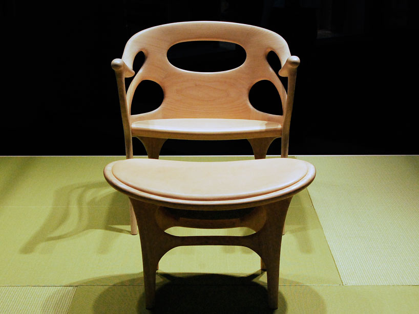
The k-chair and k-plus are the result of a collaboration between a Japanese furniture company Kitani and a Paris-based Danish designer Helle Damkjær. The curves resemble mid-century Danish designs while the cut-offs in the frame lightens up the overall aesthetic of the chair and appears more modern. I would definitely have one of these in my home, thank you.
kchair01
Side view via Design Boom

Front view via Design Boom

Monday, February 14, 2011

Valentine's Day 2011

February is the month when love pervades the air. Romance, love, mushiness...whatever you think of Valentines Day, it is infectious and you can't escape from it. Not even on this blog  :-)

This Valentines Day, sizzle up your home with...

Leopard prints. They are making a strong comeback, as are other safari prints like zebra stripes. These safari feline prints are sensual, alluring and in my humble opinion, it screams 'adults only'. 

Fresh flowers in vibrant colours that aren't professionally arranged is an inexpensive way to say "I love you".
Fresh flowers - Source unknown

If it's not your style to utter those three words, express your L.O.V.E. in writing.
Love wall hanging by Paul Smith

Warm lighting from flickering candles sets the mood if you're having your Valentine over for dinner or coffee or whatever. 
2 Candle Loop Candelabra

Here's wishing all my readers a beautiful and romantic Valentines Day. 
My husband and I - taken in Taipei 2008

* Some images are from unknown sources. Please email me if it belongs to you and I'll happily credit you for it.

Wednesday, February 9, 2011

The Perfect Colour Scheme

When it came to choosing paints for our house, it was the hardest thing to do. I'm not an interior designer and nor do I have a natural eye for colour. So, I diligently read up on how to co-ordinate colours and how to use a colour wheel.

First you have to know what a colour wheel looks like. This colour wheel from Nippon Paint is possibly one of the easiest wheels to refer to.

Now, pick your favourite colour. The trick is to find other colour combinations that match your favourite colour.

Monochromatic
Chose a colour and use a shade, tint or tone of the same colour throughout the room.
Kitchen monochromatic painting
Green colour scheme in a kitchen via Design Interior Ideas

A tip from designer Mark McCauley, author of Color Therapy at Home: Real Life Solutions for Adding Color to Your Life - use darker color values for the floor, medium color values for the walls and light values for the ceiling. He adds, "Any interior space replicates the outside world. The exterior environment is generally darker below our feet (the earth itself), medium-valued as you look straight ahead (buildings/trees) and lighter values skyward."
Darker floors, medium walls and light ceiling via HGTV

Triadic
Use three colurs that are even spaced around the colour wheel.

Triadic colours tend to be quite vibrant so you should choose one dominant colour and use the other two as complementing colours. Think 80-20-10. Use 80% of your the dominant colour on prominent features like your walls or sofa, 20% of complementary colour in medium sized items in the room like a floor carpet and 10% of the other complementary colour in small accessories or paintings.


Adjacent
Also known as analogous colours, uses colours that are next to each other or within a 90 degree angle in a wheel. For example, they can be different shades of green and yellow, all of which can exist harmoniously next to each other.
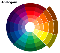


Analogous colours should be less vivid and bright. Nature demonstrates this best. Look into the twilight sky for blends of purple, blue and magenta colours or the blazing desert for yellow, gold and orange. A forest has light green to blue and purple within its depths.

Purple, pink and red - Source unknown
Earthy combination of green, yellow and orange - Source unknown

Complementary
Choose two colours that are opposite each other on the colour wheel.

Complementary colour schemes are usually vivid, energetic and uplifting.
Turquoise and hot pink bedroom via Dutch Boy

Purple and mustard in the living room via Sabine's Blog

Now that I've learnt about the different colour combinations that work, I'm feeling a little more brave and will start with a purple, black and bronze combo in my bedroom. What do you think Hubby?

* Some images are from unknown sources. Please email me if it belongs to you and I'll happily credit you for it.
Related posts

Related Posts with Thumbnails

LinkWithin

Related Posts Plugin for WordPress, Blogger...